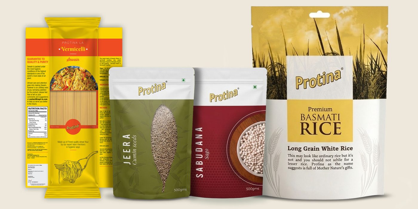
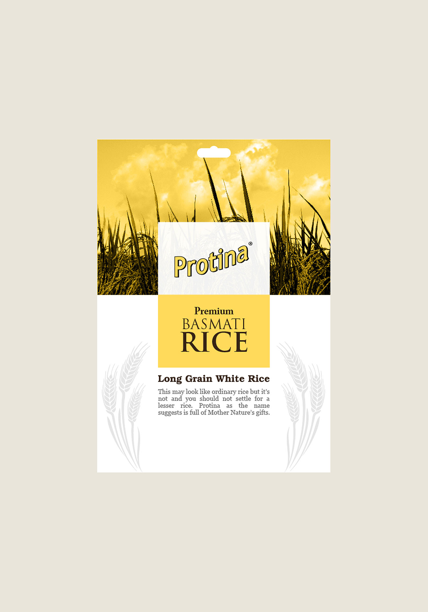
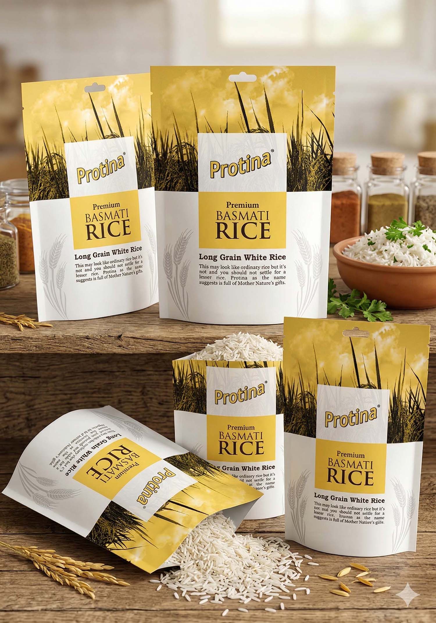
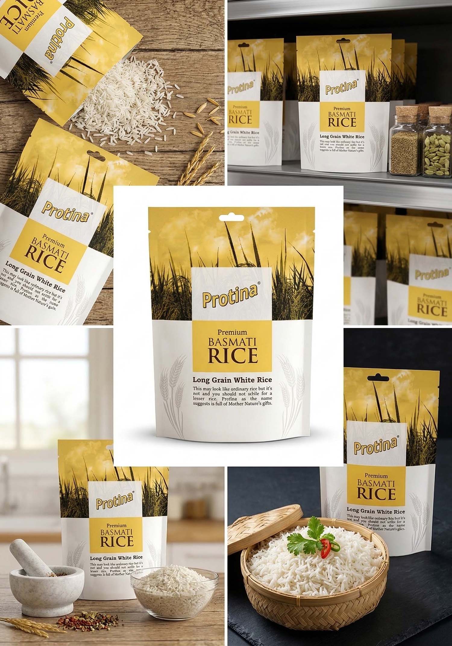
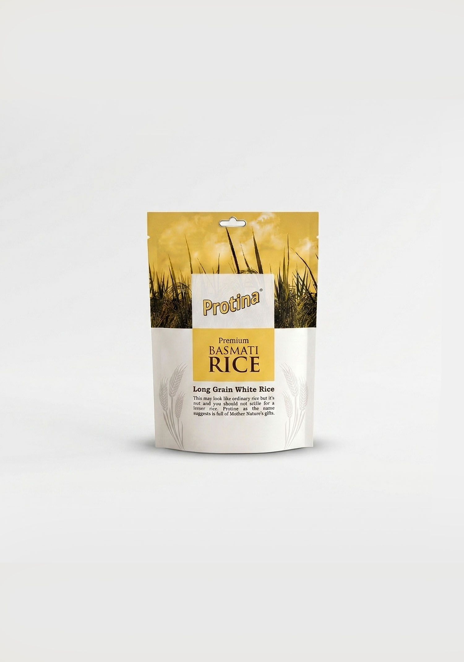
Protina is a grocery brand developed for Surana Essentials Pvt. Ltd., Alwar (Rajasthan), featuring a cohesive packaging design system across multiple FMCG products including Premium Basmati Rice, Jeera, Pulses, and Sabudana.
The packaging was designed with a unified visual identity while allowing clear differentiation between product categories through distinct color schemes, imagery, and layout variations. Each product maintains brand consistency through typography, logo placement, and structured information hierarchy, ensuring strong shelf presence and easy product recognition.
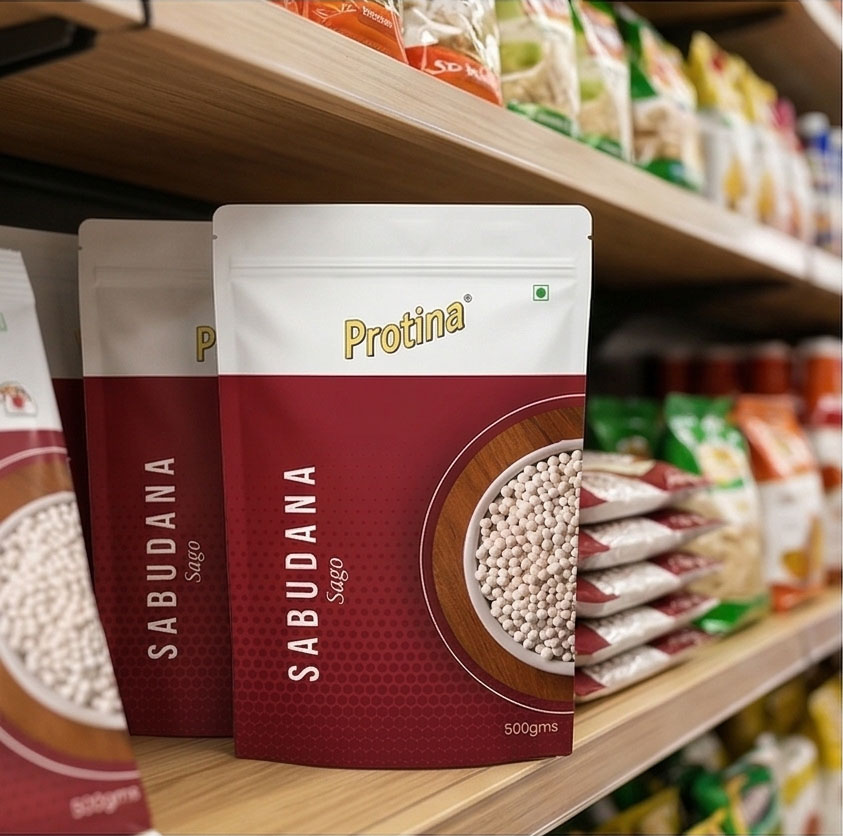
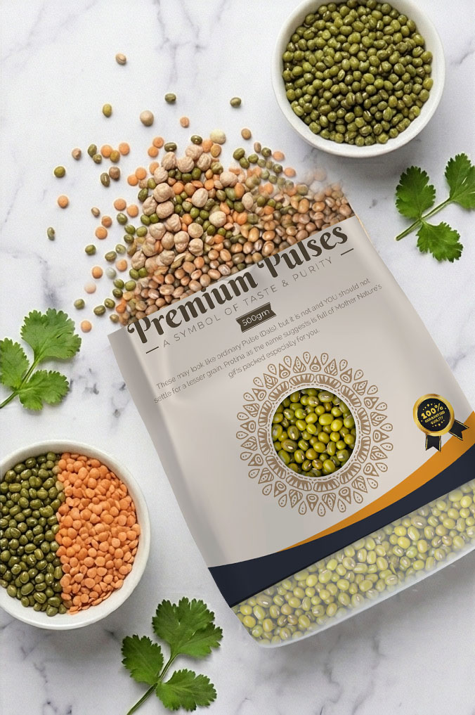
The design balances traditional grocery aesthetics with a modern layout approach, effectively communicating quality, purity, and trust. Special attention was given to usability, readability, and product visibility, making the packaging both functional and visually appealing in retail environments.
Tools Used: Adobe Illustrator CC 2021, Adobe Photoshop CC 2021
Key Details
- Type: Multi-product Packaging Design System
- Industry: FMCG / Grocery
- Products: Basmati Rice, Jeera, Pulses, Sabudana
- Style: Traditional-Modern, Vibrant, Structured
- Focus: Brand consistency, product differentiation, shelf appeal
- Brand: Surana Essentials Pvt. Ltd. (Alwar, Rajasthan)
Design System – Protina Packaging
1. Brand Consistency (Core System)
Explain what stays the same across all products:
- Logo Placement: Fixed top position for strong recall
- Typography: Same font family for product names & descriptions
- Grid Structure: Consistent layout divisions (top branding / middle product / bottom info)
- Tone: Clean, trustworthy, grocery-focused
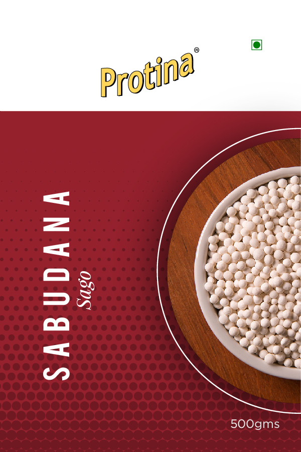
2. Color Coding Strategy (Product Differentiation)
Each product uses a distinct color while maintaining brand identity:
- Basmati Rice: Yellow / Gold → Premium, purity
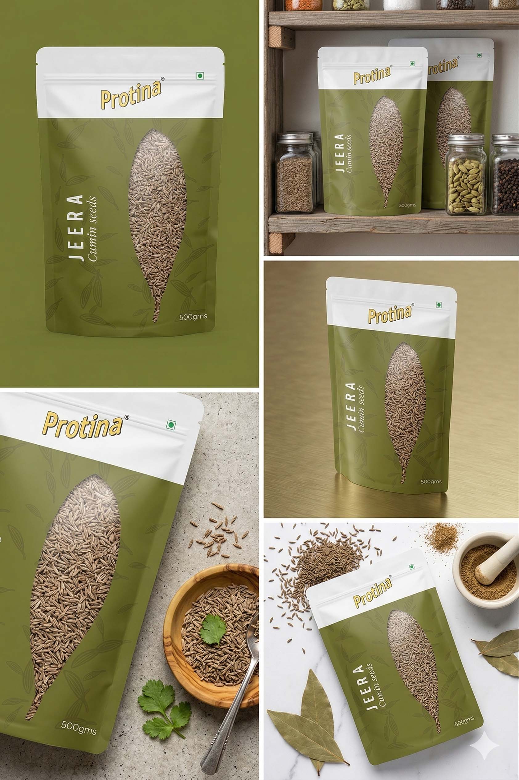
- Jeera: Green → Natural, organic spice feel
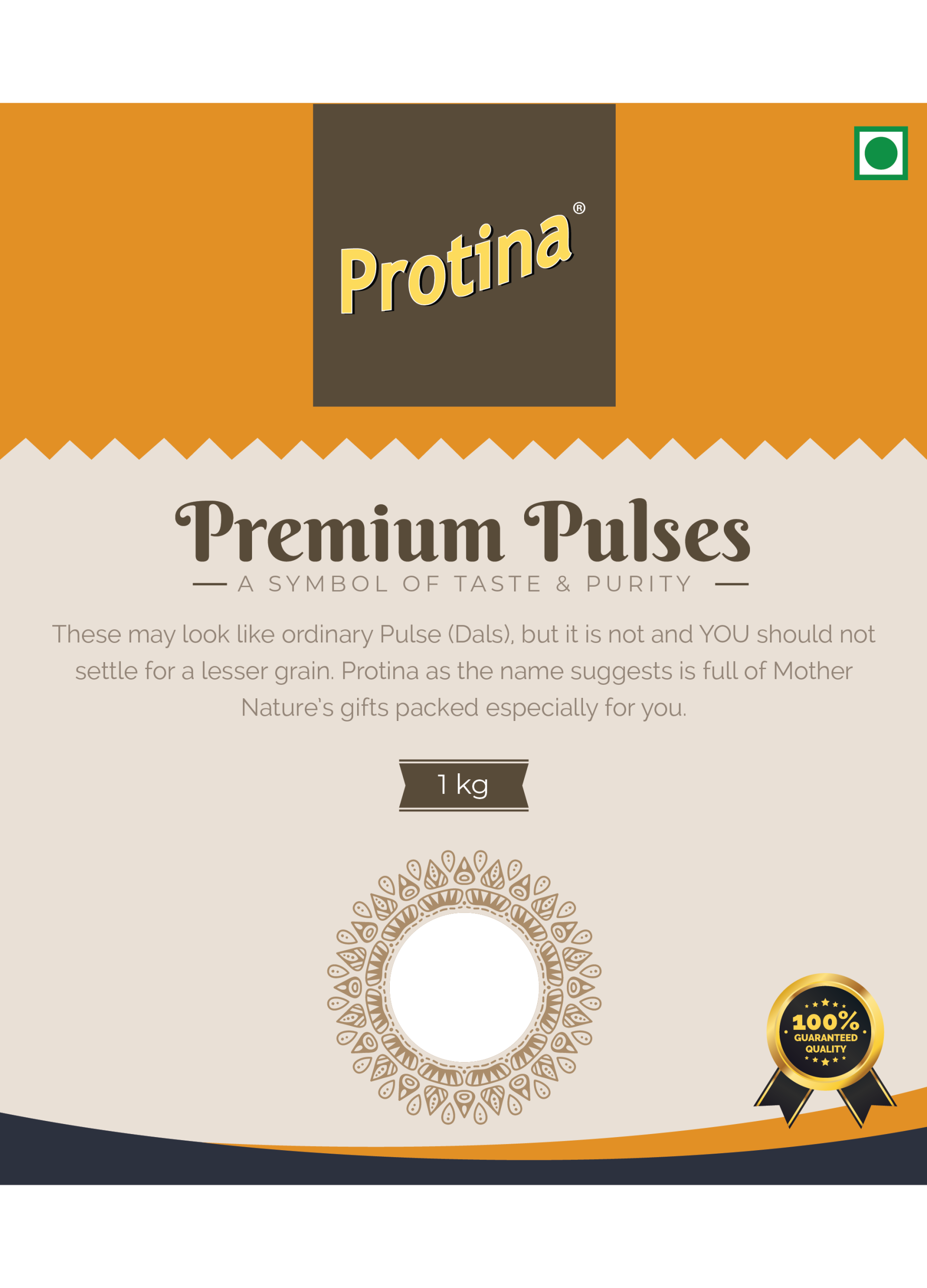
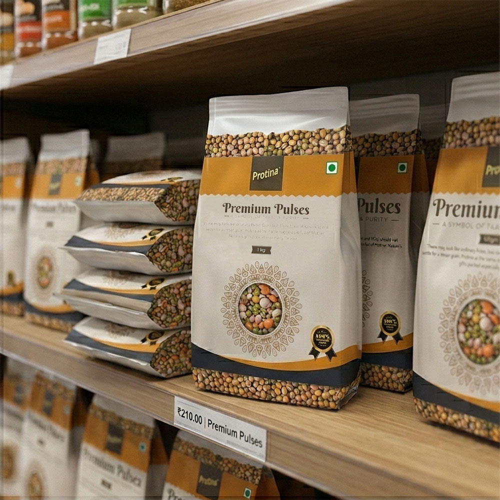
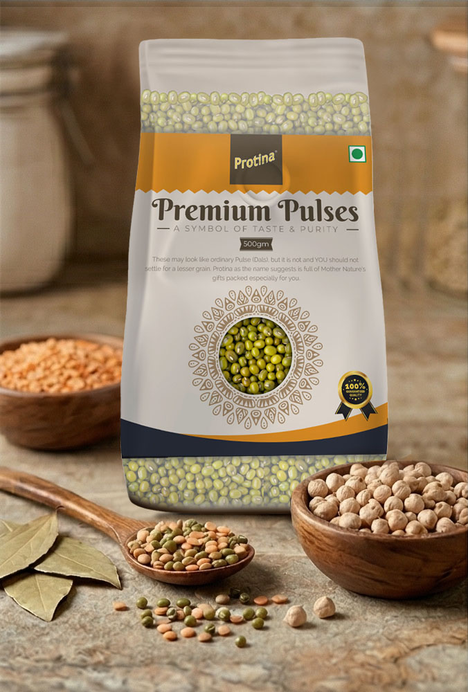
- Pulses: Beige / Earth tones → Staple food, authenticity
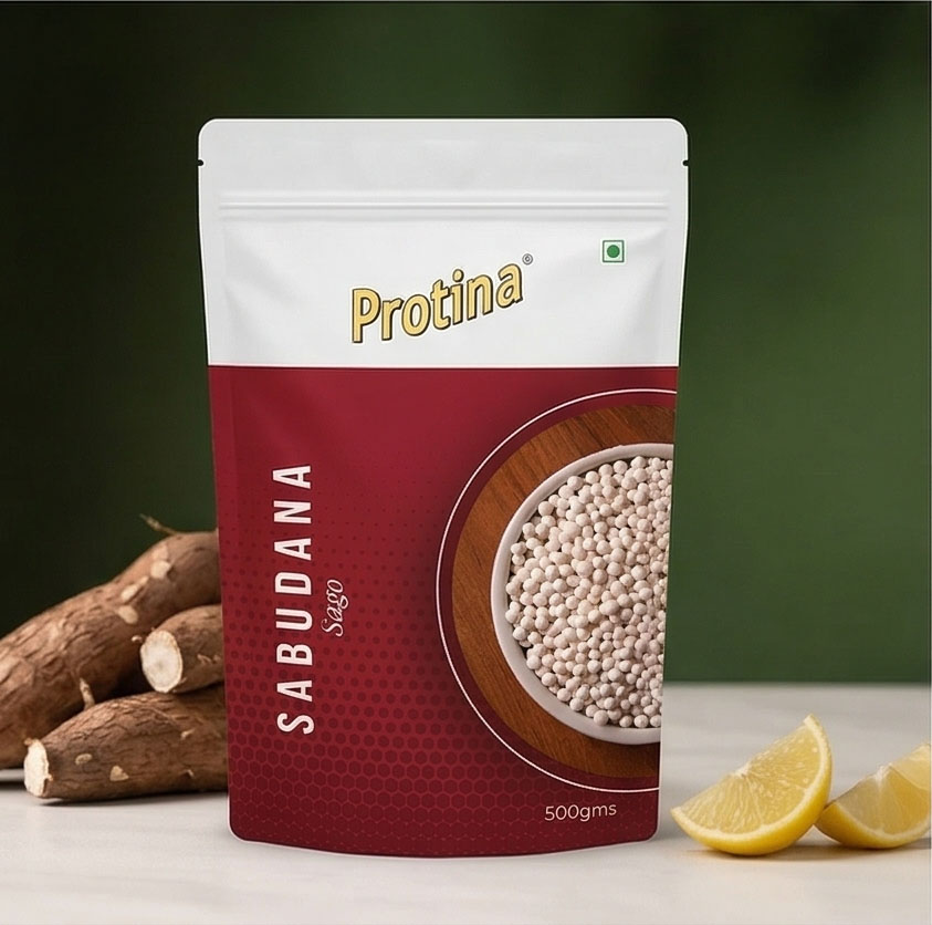
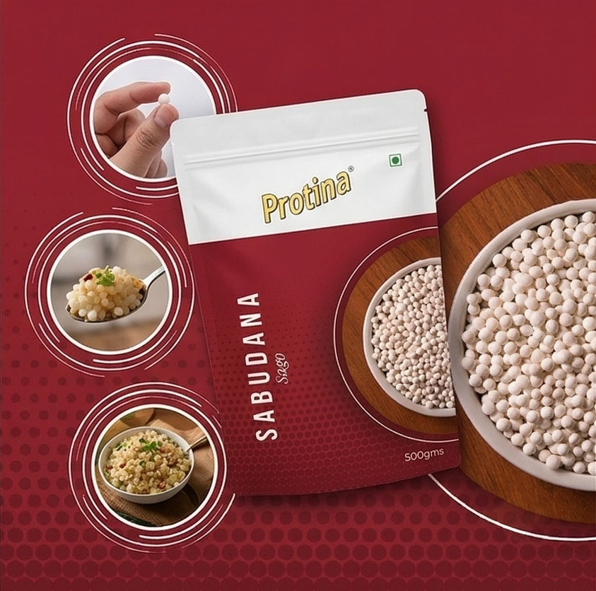
- Sabudana: Red → Energy, bold visibility
3. Layout System (Structured Design Logic)
The layout:
- Top Section: Brand identity (Protina logo)
- Middle Section: Product name + hero visual / window
- Bottom Section: Supporting text / weight / quality cues
4. Visual Elements & Patterns
- Subtle background patterns (grains, seeds, textures)
- Product-specific imagery (rice fields, spices, grains)
- Decorative elements (borders, badges, quality seals)
5. Information Hierarchy
Explain readability:
- Product name → most prominent
- Category → secondary
- Description → supporting
- Weight & icons → quick access
6. Scalability
The design system is scalable and can be extended to additional products while maintaining brand consistency.
Premium Basmati Rice
Jeera
Premium Pulses

Sabudana